|
designing
If I hadn’t been a composer I would be a graphic designer. That’s what I do on the side, a hobby. Every couple of months I design a concert flyer for the Ives Ensemble. And, as often happens, one’s hobby can prove to be more fun than a proper trade. Every time I finish a score I design and create a title page. The worksheets that I prepare are graphic designs as well — architectonic blueprints for the nascent work.
I think I have the same attitude as Erik Satie, who was always scribbling, whereas Arnold Schönberg preferred to paint. It would be interesting to contemplate on the difference between painting and graphic design. Graphic design starts with lines, while painting is more about colour and planes. It is no accident that I am very interested in Piet Mondrian. Towards the end of his life what he did with painting was close to graphic design.
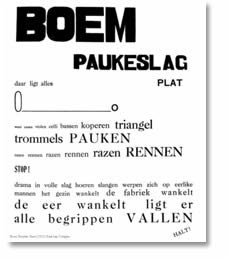
 As a teenager I started to read poetry because of Paul van Ostaijen (1896-1928). In his collection Bezette Stad (Occupied City) the Flemish poet made connections between the content of the text and its layout. As a teenager I started to read poetry because of Paul van Ostaijen (1896-1928). In his collection Bezette Stad (Occupied City) the Flemish poet made connections between the content of the text and its layout.
So I never just jot down ideas on the back of a beer mat. There are artists who start from chaos, who need some sort of ‘messy’ situation to get on with their work. Whereas I am constantly trying to create order. I am fully aware that everything is chaos, but what fascinates me is to explore how things connect.
Are graphic images helpful when I am composing? That is an intriguing question. I recently started to rely on spreadsheets because it allows me to figure out chords more quickly than I could do manually. Theoretically, with the help of spreadsheets I could restrict myself to processing figures, i.e. numerical abstractions. And yet I prefer to graphically unfold my materials, as this allows me to visually experience the proportions of the embryonic work.
I sometimes wonder which are more helpful to composing: eyes or ears? I don’t think I could create music if I were blind.
|